

To make sound business decisions, you need data. With the numerous systems you use in your organization, you likely have tons of data to reference. But that’s a double-edged sword—the more data you generate, the harder it is to organize into easily digestible information.
Whether you’re leading talent acquisition, purchasing, or marketing—or you’re a business owner wearing multiple hats—you need a way to track your KPIs in one place instead of relying on various spreadsheets and PDFs. That’s where data visualization and reporting tools such as Databox enter the picture.
What is Databox?
Databox is a tool that lets you connect and track data from multiple software solutions in one place. Instead of logging into the myriad platforms your organization uses and generating separate reports, you can build customized dashboards in Databox that pull from these disparate sources. This functionality not only saves time, but it also makes it easy to efficiently monitor the performance of your most important KPIs using a single solution.
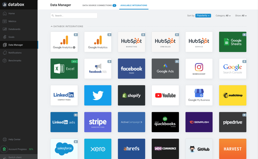
Databox dashboards have a variety of use cases across all departments—marketing, sales, customer support, ecommerce, software-as-a-service (SaaS), project management, finance, and so on. The platform also has 70+ “one-click” integrations, including tools such as HubSpot Marketing, Google Analytics, Salesforce, Semrush, and Shopify.
Databox’s 4.8-star rating on software review platform Capterra serves as some pretty convincing proof of the tool’s popularity. Not surprisingly, we agree with the masses. Keep reading to find out why it works so well for us, and get an inside look at how we use it for performance reporting with our growth content clients.
Our Databox Review
Why do we like Databox?
After using Databox for over 2 years now, here are some of the reasons why we chose it as our primary reporting tool:
- Versatility. Databox covers numerous reporting use cases, whether you’re reporting to senior leaders within your organization or external clients.
- Ease of use. Some visualization tools may be powerful, but they tend to have a steep learning curve. Databox is intuitive, providing a WYSIWYG (What You See Is What You Get) editor so you don’t have to worry about coding.
- Customization. You can build dashboards in whatever way works best for your business or specific initiative, plus track a multitude of metrics.
- Data sources. Beyond its native integrations with popular tools, you can also connect to a SQL database, send data via an API, or integrate with Google Sheets or Zapier. This comes in handy when you report to a number of clients that all use different solutions.
- Pricing. Compared to solutions that offer similar features, Databox is priced affordably.
If this Databox review seems a bit lopsided, it’s because the platform works quite well for us without breaking the bank. Is it perfect? Of course not. For example, support can be slow sometimes—it’s not 24/7, and they seem to operate in non-U.S. time zones. Still, they have always fully resolved any issues we’ve faced and have made the time to meet with us on video calls to discuss our needs and wants across our client accounts.
What did we not like about competing platforms?
Databox may be our final destination, but we made several pit stops along the way with its competitors:
- Google Data Studio was a solid pick, but it lacked an integration with HubSpot Marketing, which is something we—and our clients—regularly use. (It does, however, offer an integration with the sales version if that interests you.)
- Klipfolio lacked the same integration. In addition, the interface was more complicated, and we found it difficult to adjust different metrics.
- Geckoboard was not as intuitive—the learning curve was too steep given multiple people would be using the solution.
Databox For Growth Content Reporting: Behind The Scenes
Nectafy is a growth content marketing agency. The main reason our clients choose us is because we clearly show how our content strategy and execution provide a strong ROI in the form of organic blog traffic and leads. This is important context to consider as you review the below information on our specific usage of Databox.
How do we source data?
We use Databox’s Data Manager feature to add new connections. We simply select the integration, and then authenticate it by logging into that integration’s account. Our most frequently added connection is HubSpot Marketing, as you could probably guess from our earlier mention. Note that you must be an administrator to add data sources.
How do we organize the data?
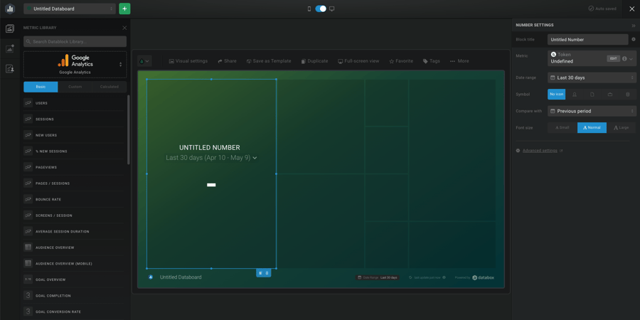
After creating a new dashboard—you can also start from a template—and connecting a data source, we use the drag-and-drop interface to add metrics. We then use the customization features to modify box sizes, change date ranges, add visualizations like pie charts, and filter lists when applicable. Note that you can use a template instead of starting from scratch, and you can create your own custom metrics.
What numbers do we track and why?
After determining the most relevant KPIs to share with our clients, we decided to build two dashboards: one for website traffic and one for blog traffic.
Website Traffic
This dashboard tracks both sessions and leads across a client’s entire website. If you’re not clear on the term, a session is the period of time a user is active on your site. A session can include multiple page views and generally ends after about 30 minutes of inactivity.
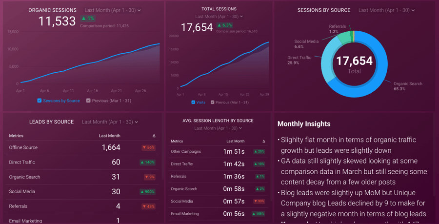
Here’s a breakdown of each of the metrics we track on this dashboard:
- Organic sessions. This is the main KPI for measuring the success of our growth content. We consider this over total sessions because the primary area we impact is keyword rankings, which is directly tied to organic traffic.
- Total sessions. While organic sessions are key, it’s still important to track total sessions to see how our efforts are impacting the rest of a client’s website.
- Sessions by source. To also inform a big picture view of a client’s website, we break out session sources:
- Organic search includes any sessions stemming from a Google search (or other search engine).
- Direct traffic covers any sessions started by a user typing a URL into the navigation bar; returning users (such as someone who bookmarked a blog post to read later); and any user the platform can’t confidently identify in another category. Note that including the last group tends to inflate direct traffic.
- Social media includes sessions that begin from a click-through on a social media site—LinkedIn, Facebook, Twitter, etc.
- Referrals cover sessions coming from a different, non-social website (e.g., links from other websites).
- Email marketing includes sessions started from a user clicking a link included in an email campaign such as a newsletter.
- Leads by source. This metric has the same breakdown as the preceding point, only it tracks leads. For our purposes, a lead is any user who, after landing on our client’s website, takes any action on the site that pushes them closer to becoming a new customer—subscribing to the blog, requesting a demo, downloading an offer, signing up for a consultation call, or otherwise submitting their contact information in some manner. Our second most important KPI is leads from organic search.
- Average session length by source. We also track how long a user is staying on the client’s website according to their origin. With this metric, we’re able to gauge how engaged our users are based on the channel from which they entered the website. Furthermore, this is a helpful metric in understanding how users are responding to the content we’re continuously publishing on the client’s website.
We added the monthly insights box as a place to quickly highlight important insights gleaned from the data. (Again, Databox is very customizable!) For efficiency, our comments in this box are applicable to both dashboards.
Blog Traffic
This dashboard limits the reporting scope to only the blog, tracking page views and blog leads.
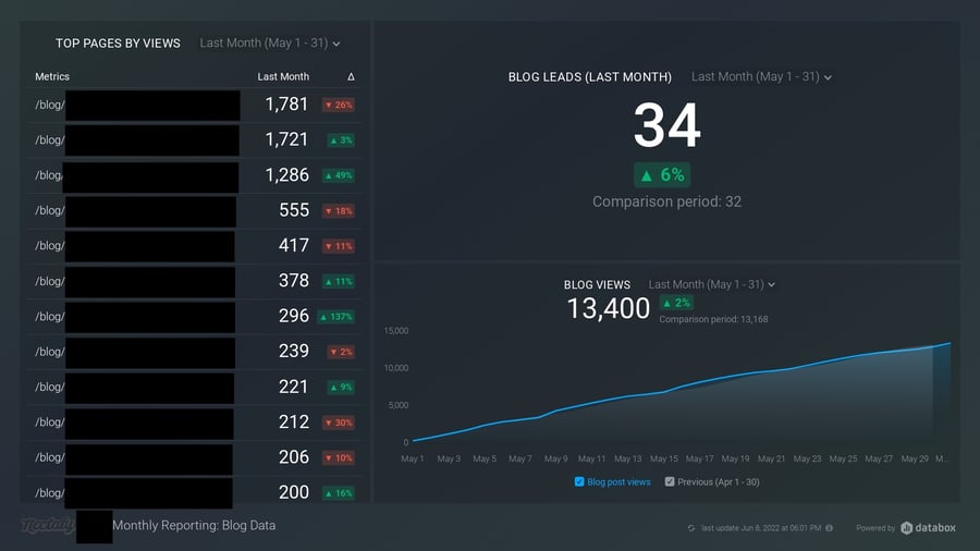
Here’s a breakdown of each of the metrics we track on this dashboard:
- Top blog pages by page views. This tracks the top 10–15 blog posts across all traffic sources.
- Blog leads. For this metric, we use a custom contact list in HubSpot; it includes anyone who entered the website through a blog post and converted somewhere on the website. This is an important KPI as we can see how many users we’re attracting through growth content who are converting to leads.
- Blog Views. This shows the total blog views across all blog pages, across all traffic sources.
How do we present these dashboards to clients?
During monthly performance reporting, we provide clients with a shareable link where we can string together and loop specific dashboards for easy presentation during our review calls. It’s much less cumbersome than exporting them and creating a standalone presentation.
Another feature that comes in handy is Snapshot—it automatically takes screenshots of chosen dashboards and sends it to whomever we choose. This is great for giving clients a quick update, as well as saving our historical data and monthly insights.
Databox Review: Key Takeaways
It’s obvious that we like Databox for several reasons, with its versatility being one of the most important. The content marketing world is always shifting, so it’s essential that we have tools we can mold to suit our evolving needs.
But is the platform the right fit for your company? Our Databox review may be informative, but it can’t make the decision for you. Book a demo or take it for a spin. There’s a free plan, so you have nothing to lose. If you like Databox, consider upgrading to a higher plan for a more robust experience.
Need help with growth content at your company?
Growth content—a data-backed approach to building high-quality content for your website—can help you attract quality leads. But not without the right strategy, sufficient time, or adequate manpower to create and publish authoritative content.
That’s where Nectafy comes in. We help strategize and produce content that brings customers to your digital doorstep.
We’ve got growth marketing down to a science, with a little art thrown in for good measure. We handle strategy, content production, execution, monitoring, reporting—every aspect of growth marketing that contributes to your business success.
We’d love to show you the magic of this highly effective marketing initiative—drop us a line if you’d like to talk.