20 Examples Of Beautifully Strategic SaaS Website Design


Right now, the world is SaaS-happy. According to SaaStr, in the first half of 2021, the total number of unique software products that a company buys on average was higher than ever before—about 124 per company! And 55% of companies plan to increase their software spending in 2022.
Predictably, the number of SaaS websites is also skyrocketing, making it harder than ever for businesses to stand out. But that’s clearly what needs to be done. In a world full of platforms “built for global scale” that can help customers “grow every part of their business” (and more of the same with a slight turn of phrase), how are you any different?
For SaaS companies, it’s crucial to design a site with a great user experience as well as lively, attention-getting copywriting.
Of course, the most important element of a website isn’t beauty or humor—it’s the ability to convert visitors into leads. Since we don’t definitively know how well these particular sites are doing in that area (though we can get a glimpse into performance with a few Semrush stats), we can’t say that modeling your own site similarly would work. However, what we do know, from having worked with many SaaS clients, is that these sites have certain elements proven to be successful in the past.
So without further ado, here are 20 of what we believe are the best SaaS website designs, and the reasons why.
20 Examples Of Beautifully Strategic SaaS Website Design
To provide some context around the sites below, we'll share some high-level statistics about each website gathered from Semrush (see below). For transparency, we are a Semrush user and affiliate. If you choose to click through and sign up for Semrush, Nectafy may receive a small commission at no cost to you.
1Intercom
Semrush Stats:
- Authority score: 70/100
- Estimated monthly organic visitors: 278,922
- Referring domains: 26,055
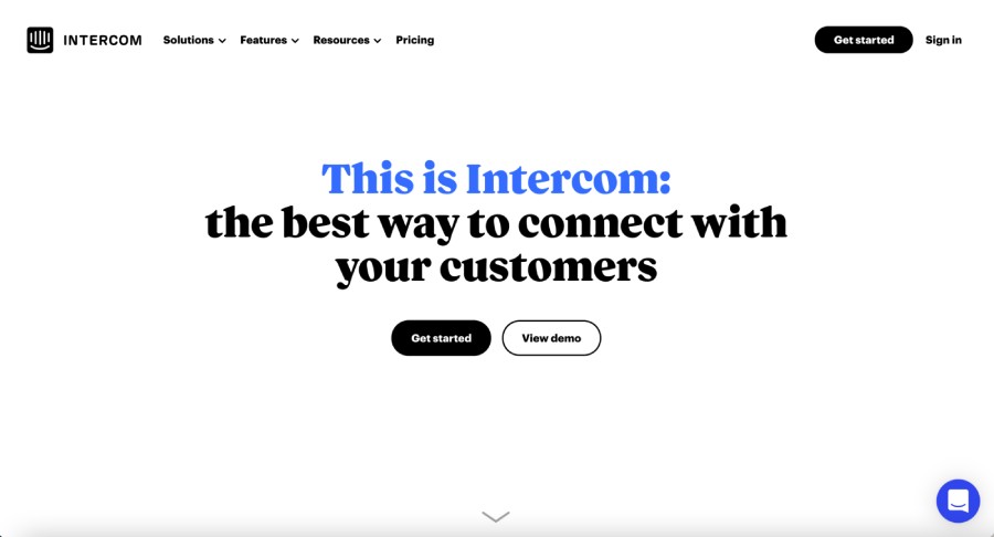
No flashy graphics here—this site for customer communications platform Intercom is clean, clear, and user-friendly. It does an excellent job of incorporating GIFs throughout to show how the product works and what it looks like in action. The site also tries to make things as easy as possible for visitors, with the footer menu directing them to relevant parts of the site according to their use case, company size, and industry.
Last but not least, Intercom’s home page is filled with social proof—it lists both client companies and tons of positive user reviews.
2Zuora
Semrush Stats:
- Authority score: 61/100
- Estimated monthly organic visitors: 103,066
- Referring domains: 7,017
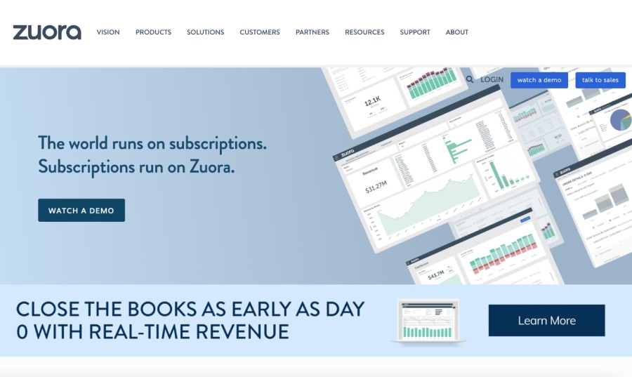
Zuora’s value proposition is front and center on its homepage: The subscription model is king, and so is the leading subscription management tool Zuora. Everything about its homepage solidifies its #1 stance, from the list of global enterprises that run on Zuora to research companies that have recognized it formally as a leader in the field. But one of the best things about the Zuora website, in my opinion, is the Customer Stories section. In addition to traditional case study summaries, these stories are also told in full in narrative form, show pictures of actual customers at work, and sometimes let the customers do the talking with short video testimonials.
3Rafflecopter
Semrush Stats:
- Authority score: 70/100
- Estimated monthly organic visitors: 5,346
- Referring domains: 74,359
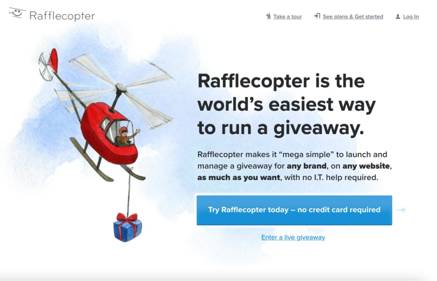
The language all over the website for this online giveaway tool generates genuine excitement about the product, and maybe that’s partly because of the product itself—after all, “Everyone loves a giveaway.” But there’s also some welcome straight talk that makes us want to partner with them: “We run Rafflecopter the way we wish other companies did business. We’re not into shady gimmicks or nickels and dimes.”
Aside from clever copy, it has a fun, clean design, and everything visitors need (and want!) to know is above the fold on the homepage—what the product is and how incredibly easy it is to use… “srsly!”
4Help Scout
Semrush Stats:
- Authority score: 66/100
- Estimated monthly organic visitors: 432,734
- Referring domains: 22,852
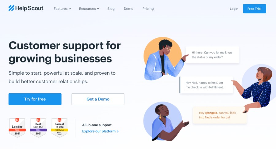
While less obviously warm and fuzzy than Rafflecopter, Help Scout’s website for its customer support tool is equally as engaging. From the friendly visuals on the homepage to the many videos, product shots, and customer quotes throughout, there’s no shortage of diverse content to draw in visitors. The About page also conveys this small company’s values in a way that is authentic. Its mission mentions serving people in a “human” way (an approach that seems refreshing these days). It also builds trust with statements like these:
Who wouldn’t want help from Help Scout?
5DocuSign
Semrush Stats:
- Authority score: 68/100
- Estimated monthly organic visitors: 2,208,450
- Referring domains: 21,180
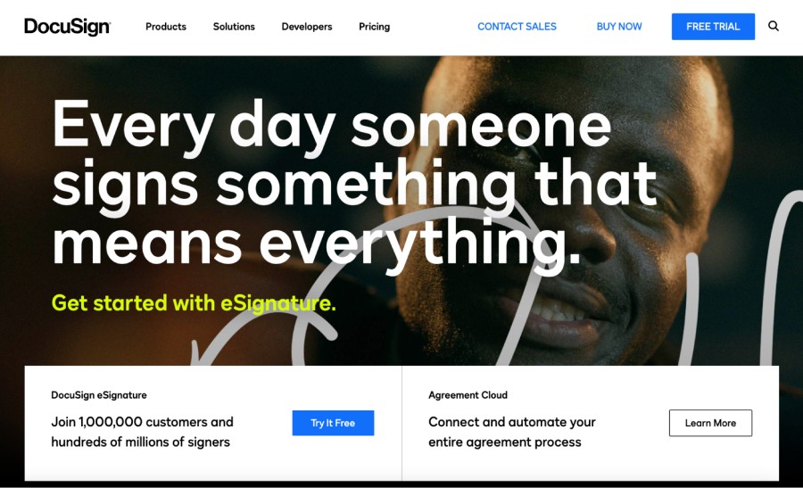
Everything about DocuSign’s website is BIG. Its font size is big. Its statements are big (“Every day someone signs something that means everything”). And the benefits of becoming a user are boldly stated. While that could be a turnoff, it seems to work on this site, creating a sense of urgency that we join the one million customers already using this tool. For visitors unfamiliar with its offerings, the homepage also features a well-made video that fully explains DocuSign’s Agreement Cloud.
6Blackbaud
Semrush stats:
- Authority score: 70
- Estimated monthly organic visitors: 301,072
- Referring domains: 13,800
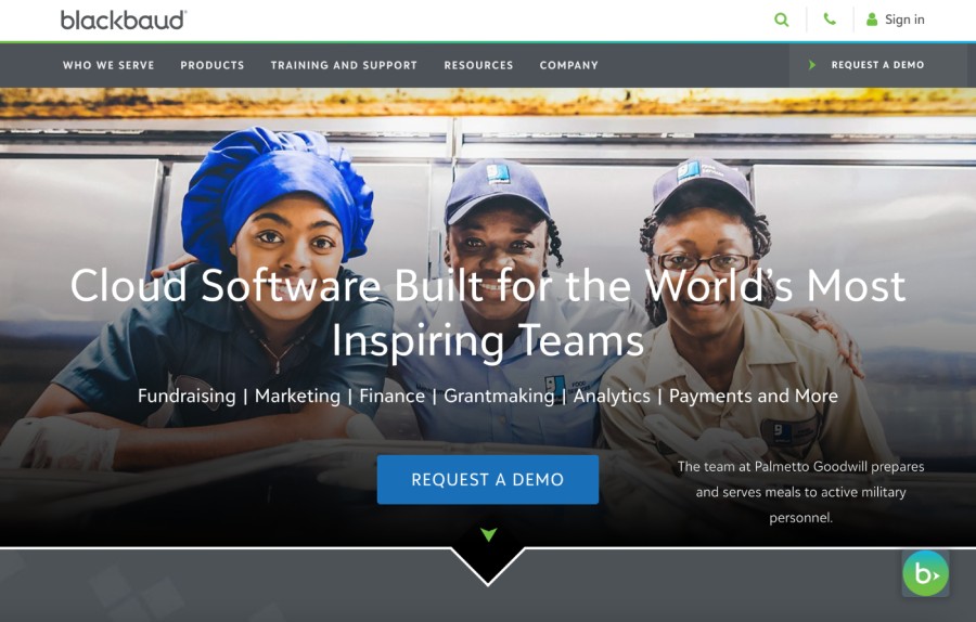
Attractive and engaging, Blackbaud’s homepage also effectively hits all the highlights of its SaaS product offering, from defining what the product is and who it’s for to presenting a slew of data supporting its claim to be the “leading cloud software company powering social good.” Overall the site is easy to navigate and the text is simple to understand; it’s also filled with appealing visuals at every turn.
Blackbaud also highlights its own philanthropic efforts on its corporate social responsibility page—likely a major plus for the nonprofit institutions it serves.
7Jotform
Semrush Stats:
- Authority score: 84/100
- Estimated monthly organic visitors: 2,444,451
- Referring domains: 239,922
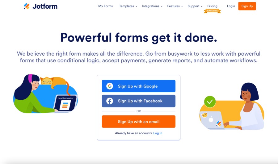
Jotform's homepage is short and sweet yet accomplishes two goals very well:
- It clearly explains the service and value provided. Too many SaaS companies get caught up in being too creative or relying too heavily on benefits that obscure the description of the service. Jotform makes it clear right away.
- It offers an easy way to get started with the free version fast. Jotform understands most visitors’ basic desire: They need to make a form now. So Jotform makes it super easy to do that: Just sign up here to “Create online forms and publish them. Get an email for each response. Collect data.”
Bada bing bada boom.
8Gusto
Semrush Stats:
- Authority score: 66/100
- Estimated monthly organic visitors: 751,529
- Referring domains: 14,211
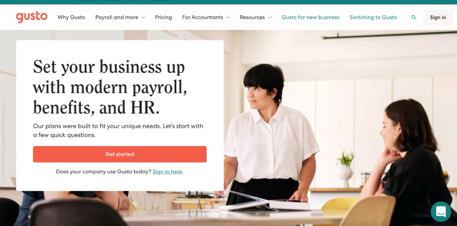
Gusto takes a different tack to engage visitors than employing the usual “Sign Up” or “Request A Demo” button. Instead, it tries to draw people in by asking them to answer a few quick questions about what they need—a clever idea. Its chatbot is also a bit different in that it offers a selection of categories for queries. Whatever category you choose, the bot sends back a link where users can find more information. Finally, they also mention pricing on the homepage, making a compelling case for cost-sensitive visitors to stay and explore. All in all, Gusto has made a number of smart design choices that should have a positive impact on conversions.
9Evernote
Semrush Stats:
- Authority score: 82/100
- Estimated monthly organic visitors: 1,932,462
- Referring domains: 231,830
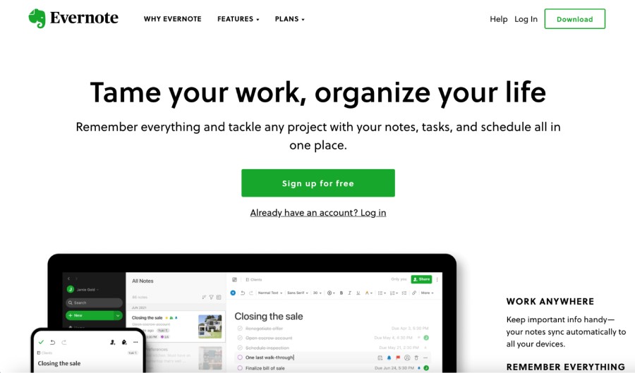
Evernote's site has some well-written copy that nicely conveys the product’s purpose and value proposition, including some catchy headlines like, "Tame your work, organize your life.” and “Remember everything. Accomplish anything.” It also presents some compelling positive review quotes about the software from powerhouse media outlets such as Forbes, Inc. Magazine, The Verge, Entrepreneur Magazine, and more. And the large, minimal text and clean graphics allow that copy to shine. The Evernote site manages to be distinctive yet still keeps things simple.
10Tableau
Semrush Stats:
- Authority score: 76/100
- Estimated monthly organic visitors: 2,792,903
- Referring domains: 109,012
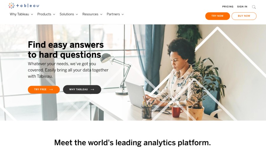
A data analytics software site could be intimidating, but Tableau is not. Their headline, “Find easy answers to hard questions,” says what you’ll get from this software in a nutshell, and they’ve done a good job of speaking plainly and avoiding jargon throughout the site. I also love the sub-navigation menu that allows visitors to explore a bit more about Tableau—including its community, integrations, and ease of use—without leaving the homepage. They also have an excellent collection of customer stories and numerous learning resources for users.
How much could your company grow with growth content?
Calculate your expected growth in organic visits based on the average Nectafy client.
Get all these numbers in your inbox.
11Trello
Semrush Stats:
- Authority score: 83/100
- Estimated monthly organic visitors: 4,870,053
- Referring domains: 234,267
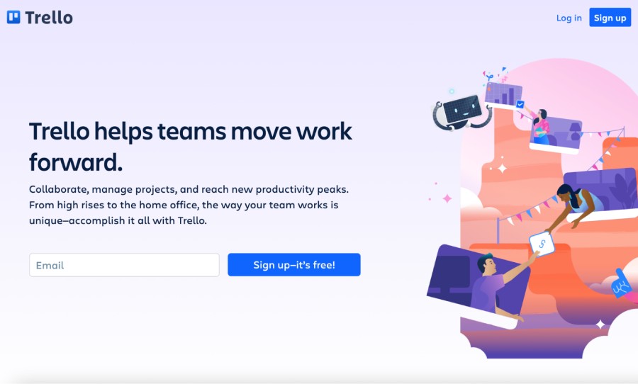
The Trello site is inviting thanks to its engaging copy and warm visuals, but it also clearly knows what potential customers want: Much of the homepage is devoted to the various “features to help your team succeed.” In addition to a “sign up” CTA, it also tries to pull in willing visitors by inviting them to “start doing” with the click of a button. Finally, Trello offers just the right amount of social proof on its homepage to let people know it’s a leader in collaboration software—and has reliably delivered results for numerous companies already.
12Sketch
Semrush Stats:
- Authority score: 67/100
- Estimated monthly organic visitors: 1,307,372
- Referring domains: 17,896
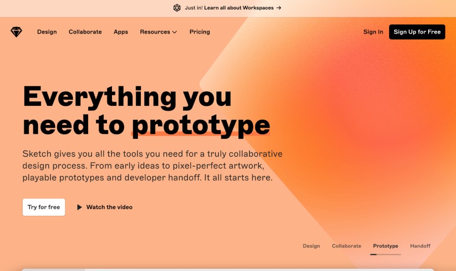
It only makes sense that a tool used to create beautiful designs has a beautifully designed website itself. Sketch uses a combination of high fidelity mockups and aesthetically pleasing wireframes to hint at the platform, while also showcasing important features, such as speed, plugins, prototyping, and much more. The final call to action at the bottom of the page is both beautiful and attention-grabbing.
13WooCommerce
Semrush Stats:
- Authority score: 82/100
- Estimated monthly organic visitors: 1,125, 286
- Referring domains: 147,841
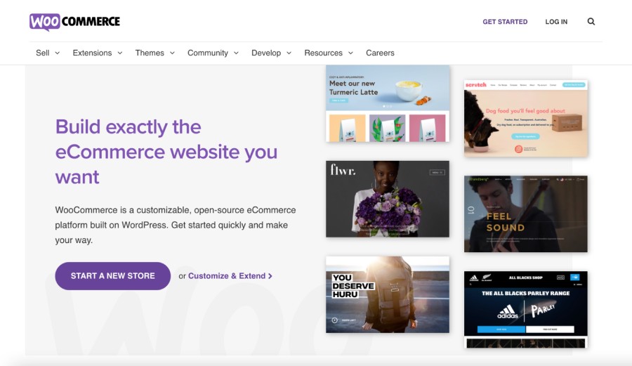
For visitors dreaming of the possibilities for their new ecommerce site, WooCommerce draws them in immediately with a collection of ideas front and center. The CTA likewise gets people excited to “Start a new store.” WooCommerce also does an excellent job of addressing potential concerns that may crop up for first-time site builders, emphasizing its trustworthiness, customer support, and availability of a learning community. The company clearly knows its customer.
14Slack
Semrush Stats:
- Authority score: 81/100
- Estimated monthly organic visitors: 5,860,290
- Referring domains: 144,197
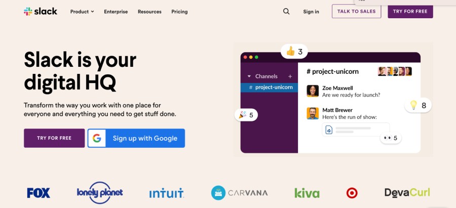
The design and colors of the Slack website reflect the application itself, giving users a real feel for the product just by visiting. The typography and messaging is simple and to-the-point, and the plentiful use of images, logos, and other subtle graphics help visitors to easily digest the information presented. At this point, however, few people don’t know what Slack is, which is perhaps why their homepage delves a little deeper than most. It includes multiple videos about important features of the software and how easy it is to get started. (Their site also offers a compelling case for using Slack over email—they clearly understand their competition.)
15Recurly
Semrush Stats:
- Authority score: 61/100
- Estimated monthly organic visitors: 20,506
- Referring domains: 4,303
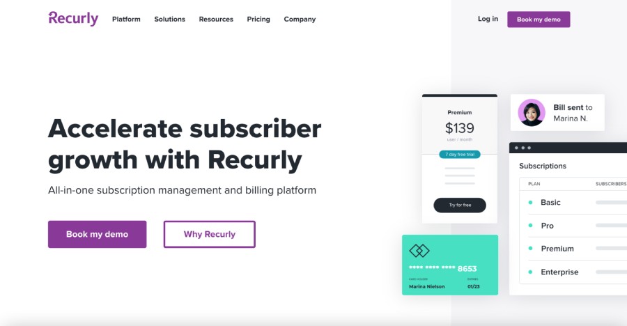
This SaaS website makes great use of color and messaging. It has a tranquil yet bold color palette and offers a taste of the brand through illustrations and iconography. Simply describing itself as the “everything for subscription success platform,” Recurly’s site copy is written in a way that makes visitors excited for the possibilities, using phrases like ”Supercharge your customer acquisition” and noting that “Leading subscription brands have crushed all kinds of goals with Recurly.” It’s an approachable, friendly site overall.
16Trading View
Semrush Stats:
- Authority score: 82/100
- Estimated monthly organic visitors: 31,555,907
- Referring domains: 91,685
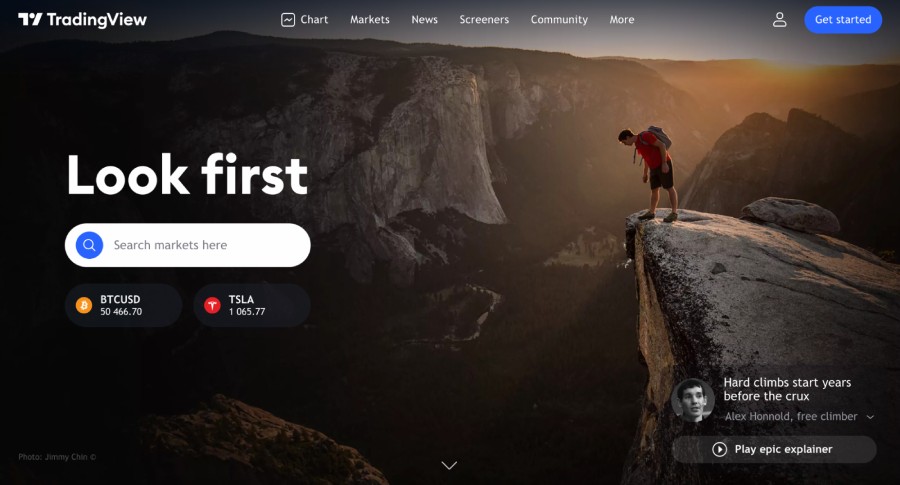
Some of our own team members use this SaaS tool on a daily basis. We love the site because it says what the product does in just a few words—the rest of the page is data, ideas, and a market summary, complete with interactive tickers and a logical navigation structure. The color palette and typography go very well with this product, and it encourages visitors to immediately start using the tool to see what it is about. Another bonus: Visitors can use a number of features immediately without signing up.
17Acorns
Semrush Stats:
- Authority score: 66/100
- Estimated monthly organic visitors: 328,832
- Referring domains: 16,257
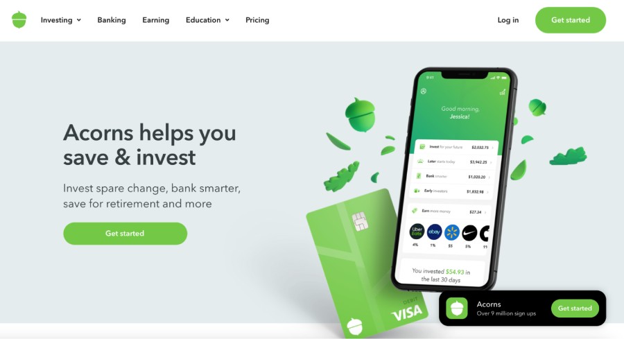
The Acorns site does a good job of making investing seem less intimidating. It has a basic design and soothing color palette and talks about investing in terms of pocket change and… well, acorns. The “Get Started” button is accompanied by a note that you’ll be joining nine million other users—a great way to show social proof. And you can create an account with just two pieces of information—an email address and a password—a tactic that probably works well to draw in its target audience.
18Rakuten
Semrush Stats:
- Authority score: 79/100
- Estimated monthly organic visitors: 11,855,540
- Referring domains: 87,312
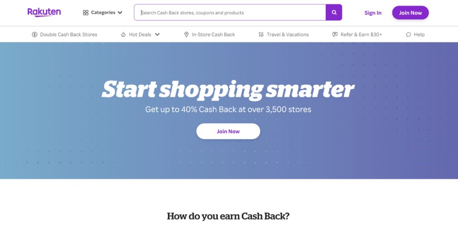
Rakuten’s homepage addresses what must be the top question on every reader’s mind when they arrive here: Is this offering too good to be true? Not only do they answer that specific question immediately, but they also go out of their way to explain how the service works and provide stats and review sites that legitimize their operation. They also make it easy to see participating stores and cash back percentages before you sign up.
19Lately
Semrush Stats:
- Authority score: 40/100
- Estimated monthly organic visitors: 8,268
- Referring domains: 805
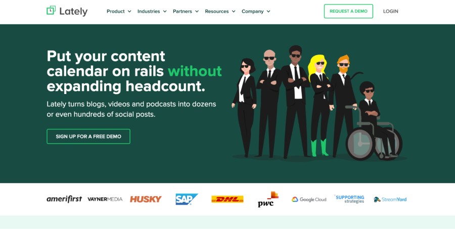
Lately’s site pulsates with energy, making visitors feel pumped to get started churning out content. It validates its offering with plenty of good data points, but the language it uses is far from stuffy. In fact, it’s quite the opposite—down-to-earth and easy to understand. Two demo buttons immediately catch visitors’ attention, and if you continue to scroll down on the homepage, there are several opportunities to see how Lately works. Overall it is a well-written, well-organized site.
20Cornerstone
Semrush Stats:
- Authority score: 71/100
- Estimated monthly organic visitors: 183,002
- Referring domains: 17,500
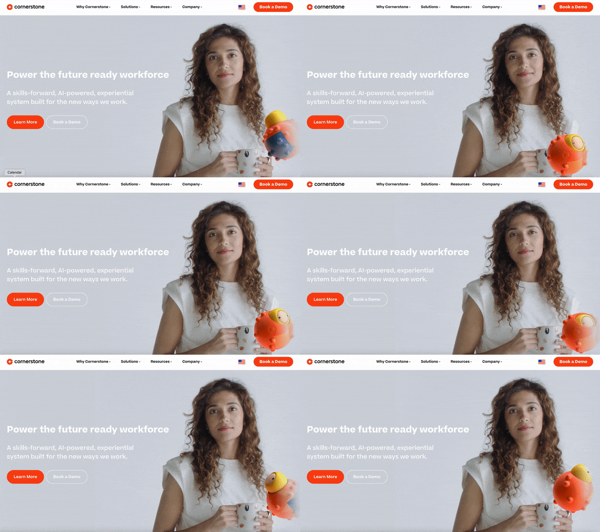
At first glance, the homepage for Cornerstone’s cloud-based talent management software appears to be innocuous enough, but the slight movements in the featured image keep visitors spellbound for a minute. (Similar images are used on a number of pages.) Overall, the site employs minimal text, an abundance of white space, and strong copywriting; these elements come together to convey the image of a forward-thinking leader in the field. Its structure is fairly typical, but the simplicity of the presentation makes for an excellent user experience.
Sites are constantly updating, so tell us if you see an outdated screenshot (just leave a comment below, or tweet us @nectafy).
One final thought: Great design can be a huge factor in your company’s success, but even more important is attracting the right people to your SaaS website—and converting them into customers. That’s what we do at Nectafy. Download the offer below to find out how we do it.

